Avoiding a Cliche Christmas – with Citipost Mail
When you’re looking to put a seasonal spin on your brand identity it’s very easy to do something obvious or cliche.
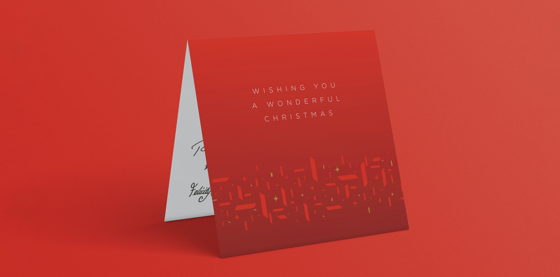
So it was really refreshing to work alongside the team at Citipost Mail to develop this years festive styling, which has been in use on both internal and external communications, and marketing material throughout December.
We created a repeating pattern featuring the lozenge shape from the brand logomark and introduced a darker red colour to help showcase the brands primary red and global gold colours.