Fork

Fork
Delivering brand consistency for a new independent Kitchen & Deli
The Client
Fork is a family start-up in Hadleigh Suffolk. Its founders have extensive experience in the hospitality industry working for one of the region’s most prestigious hotel groups and have set up their own business to provide eat in dishes and deli delights to take away.
The Brief
• Create a brand identity that was clean & modern
• Branding needed to be responsive enough to work across large format signage, social media channels, event marketing & product packaging
• Work within a limited ‘start-up’ budget
The Solution
In order to stand out in a busy high street it was important that we created a high impact design that could easily be adapted across a variety of products and ranges whilst maintaining brand identity.
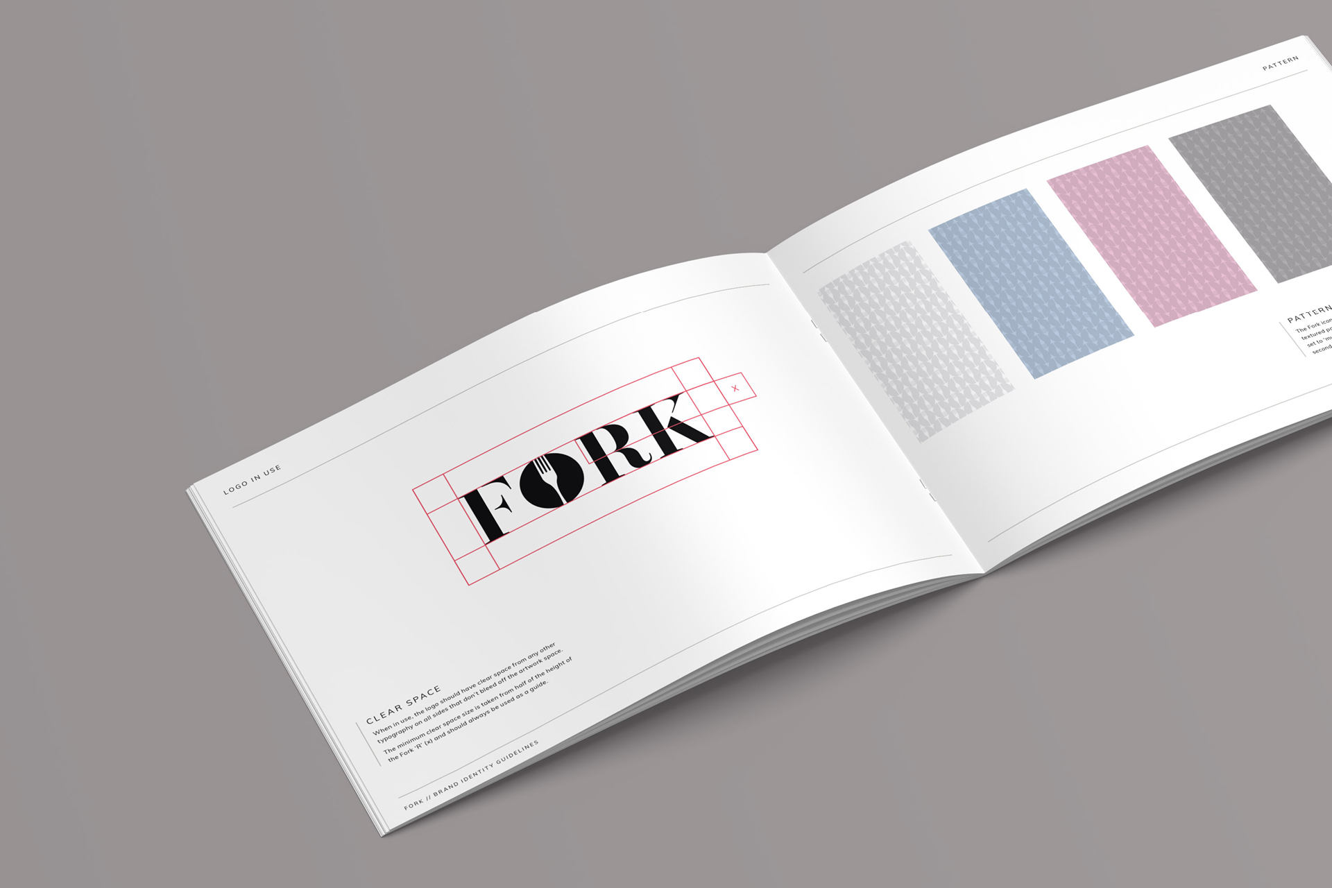
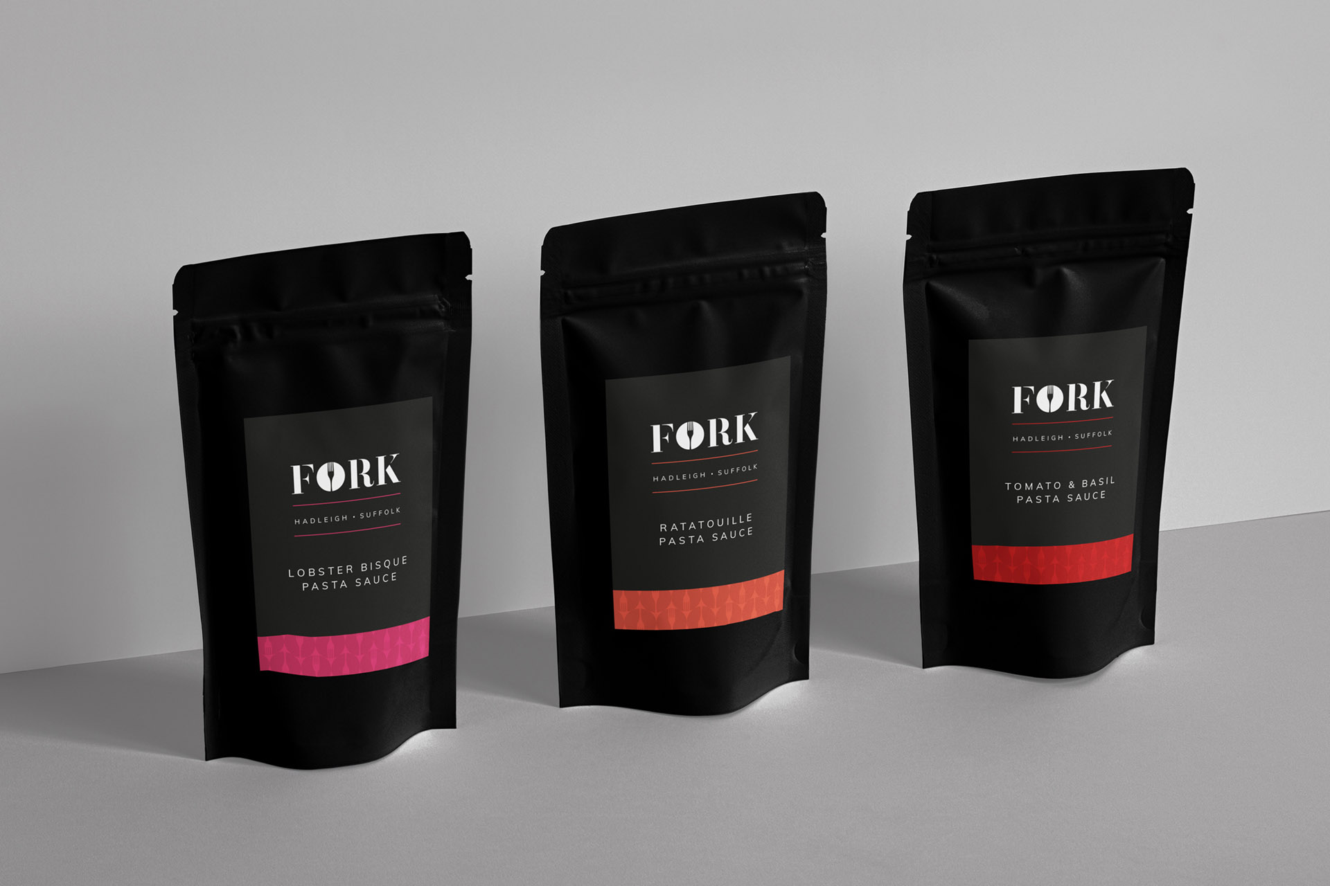
We chose classic black and white, with the addition of 14 secondary colours that are used to colour code products in the same range. The ‘O’ in Fork can be used as an icon and is easily recognised and we used a repeating pattern in the background to add texture and depth to the designs.
To easily identify the products in the ‘Mini Fork’ range, which have been developed specifically for children, and the ‘Bake at Home’ range we created sub brand identities that can work independently or as members of the larger Fork product family.
It can be challenging working within a budget and to tight timescales, but we communicated regularly throughout the project to ensure everyone involved was up to date with the latest progress and any changing priorities. We had a clear brief from the outset which ensured Fork received all the collateral required to form a strong brand identity, on time and on budget.
Deliverables
• Logo & Brand Identity
• Brand Guidelines
• Over 80 Product labels
Info
Case Study, Food & Beverage
28th January 2021